Everydub + Inspiration

VM
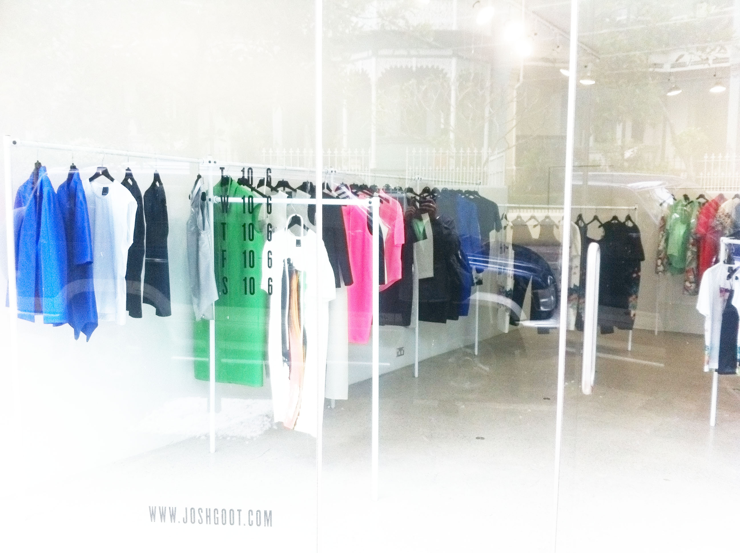
The clarity of the store window goes straight to the point of simplicity and structure of the designs
A few days ago, I visited the Josh Goot store in Paddington, not only for my own interest, but for my assessment for Fashion Merchandising this term. My task is to analyse the overall merchandising of the designs within a store and the store itself. I had no doubt that since Josh Goot is one of my favourite Australian designers, I would use the store for my report.
Neon has always glowed throughout Mr. Goot's collections
I've passed by the store a couple of times before, and I have always loved how it stands out among the terraces in Paddington. The crystal clear studio is perfect for showcasing Josh Goot's designs, the vibrancy of the neons and pop colour against the white walls attracts anyone who walks by.
The neons and graphics are beautifully broken up with complementary neutrals.
As you shop around the store, each rack separates the three main aspects of the collection — neon, graphics and neutral. I'm saving his wonderful graphics for last as his prints have always been the pinnacle of his designs. I've noticed that the upcoming trend for the Spring/Summer season encompasses a lot of pairing neon with neutral colours in a way which complements the blinding beauty of fluorescence. 
Mr. Goot's signature graphic prints are displayed to bring in the passers-by
Last, but certainly not least, the graphic prints which Josh Goot is known for are strategically placed to attract passers-by into the store. I cannot describe to you how much I love his prints, but the least I can say is that, if I was a girl, I'd always wear Josh Goot.
All images taken by me